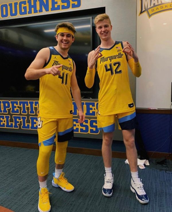
While every team has uniforms and a good number of them release new or special unis every year that get media attention, it’s not a homer bias to say that Marquette’s history with uniform sets it apart from just about every other NCAA basketball team.
I don’t have to go through it with you in detail, (as I have in the past) but between bumble bee bannings, players designing their own jersey (leading to a 30 for 30), and just a generic sense for fashion forwardness, Marquette switching up a uni set is cause for attention.
And so it was this past weekend, when an inquisitive Twitter folower noticed a new MU uniform on sale at Fanatics.
We were able to confirm the authenticity of the product. You can only tell so much from a computer generated image, but I wasn’t exactly feeling it.
Less than 24 hours later, the team itself gave us plenty to look at and talk about, with the official high quality, full uniform release.
The Good
The shorts are phenomenal. Not only do they incorporate Al on the belt, which frees up some real estate on a cluttered jersey, but the 3 tone diagonal look is completely unique and something that screams Marquette.
In fact, they do sort of recall an early 90s look Marquette used before, as @MUOverload pointed out on Twitter.

Funny enough, I did not like those, but really like these. Again, the tri-tone makes them so distinctive, and only having one logo or wordmark definitely helps.
When you add the shorts to the jersey, at least for the Gold set, it really gives it a great, unified aesthetic appeal.

Finally, the number font is also unique and I am a fan of the 3D look. It may not pair well with the wordmark font on the front, but on the back it looks great.
The Meh
The most noticeable change is a uniform font that at first glance came out of nowhere, with an eerie resemblance to a famous brand of power tools.

I’m starting to warm up to it, but haven’t gotten there yet. While it’s true MU has changed up the wordmark plenty over its history, the bubblish block lettering still used on the logo still felt modern and had a long legacy with MU. This one doesn’t really have much to tie it to the past.
That’s why I’m particularly drawn to this small tweak from @dmaciejewski instantly brought the whole set up a notch, as it used the wordmark used in a mid 70s uniform set.

The Bad
I can’t stand losing the side piping. I don’t know if it’s a formative bias thing, but even neutrals referred to that pattern as the Marquette style, with those neutrals being the Jordan brand. I wasn’t a huge fan of how the previous set made the piping way too thin, but it was still there. Taking it away altogether removes a huge part of the MU identity, in my personal opinion.
And I hate the shoulder coloring. I know I said it looked fine on the full uni set because it matched the short’s design, but as a standalone, the shoulder design makes it look like a track top.

I don’t like it on the navy or the gold, so I guess the baby blue will be TBD, but I’m already primed to hate it.
Speaking of hate, I can’t stand how that the MU logo on the shorts clashes with the wordmark on the chest. Not only does the color not match, it’s two completely different styles. I get that MU isn’t changing it’s logo any time soon, but it’s never been on a uniform set before, why start now. As much as I do think it looks great on the shorts in isolation, together with the chest wordmark, it creates a confused dynamic that doesn’t look right.
The Verdict
Add all of that up and what we get is a distinct, unique uniform that will take time to grow on me.
It’s not awful. The fact that no one in the country has anything like this, and that in a year or two there will be some duplicators of this style tells you as much.
I just don’t feel that it’s “Marquette” enough.
But hey, there was nothing “Marquette” about the untucked jersey, or the urban camo, or even the original 70s side piping reupped by Converse. While I personally prefer building off of classics in our history, it is also well within MU’s history to buck the past and present and reel in the future.
With all that said, the only thing that will ultimately matter is how many Ws and deep March runs take place in those jerseys. Win and I’m sure most will come to love them.


Leave a comment