It’s a Friday afternoon before a Holiday weekend. Let’s not kid ourselves, no one is working right now. What better way to break up the lack of productivity than to look at some pretty (visually) ugly (statistically) shot charts from the great new site Nylon Calculus. Their main focus is on the NBA game, but they were kind enough to drop last season’s NCAA shot charts today.
Tracking every player’s shot chart is something I’ve intended to do for three years now, but it is tedious, labor-intensive work that isn’t conducive to a guy with a non-sports job and a family. As such, it never materialized. Lucky for me, Nylon Calculus did all the hard work of gathering stats and presenting it in a easily digestible manner.
On their own, shot charts are fun to look at but not necessarily great for making sweeping statements. Everyone knows Chris Otule worked exclusively in the paint, so seeing it in a picture form isn’t a huge revelation. These charts are great for comparisons between players from year to year, though, where you can see the development and evolution of a shooter.
As we only have access to last year, this post is not going to be big on analysis, but rather put them out there in one concise package for future use. Be sure to see them on the actual site we linked above, as they go into more detail regarding percentages and volume.
Deonte Burton
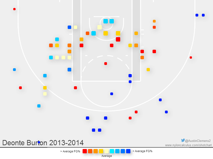
Image and data from Nylon Calculus
I was a bit surprised to see that Bane was average or below average at the rim. My hindsight bias has me remembering bucket after bucket at the rim. He forced a lot of awful shots throughout the year, so that probably didn’t help matters. Other than that, there’s not much to analyze. No particular hot areas of the court and a bit of a bias towards his strong hand just outside of the paint.
John Dawson

Image and data from Nylon Calculus
That’s a lot of blue. His playing time was sporadic (at best) so this isn’t a complete picture of his offensive ability, but for anyone claiming he would have been a savior last season is unwilling to admit the reality that statistically, he wasn’t very good.
Derrick Wilson

Image and data from Nylon Calculus
The only surprise here is that red block in front of the free-throw line. Before anyone get excited, only 5 percent of his shots came from here, hence the small size of the block. And although he didn’t shoot very well at the rim, it is encouraging that the biggest blocks are there. In fact, the size does not do it justice. About 74% of his shot volume came within five feet of the rim.
Jajuan Johnson

Image and data from Nylon Calculus
Pretty boom or bust for Jajuan last season. With the lack of playing time for long stretches of time, this is another chart that should be taken with a grain of salt.
Davante Gardner

Image and data from Nylon Calculus
I never noticed how much Davante favored his right hand until I saw this chart. And for all the talk of him being a decent mid-range shooter, the data says something else. It was pretty much paint or bust for him.
Jamil Wilson
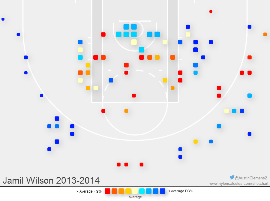
Image and data from Nylon Calculus
This is a fairly filled out chart with a good distribution inside and out. He definitely favored the right side but seemed to do his best shooting from straight away. And as always, the biggest criticism against Jamil has been his lack of aggressiveness. Seeing the myriad of blue around the rim only reinforces that.
Juan Anderson

Image and data from Nylon Calculus
No description needed.
Todd Mayo

Image and data from Nylon Calculus
It seemed at times as if Mayo was the only player who could create offense on his own last season, and this shot chart proves it. The only other Marquette player with a red box at the rim was Steve Taylor and he only had one. Mayo was absolutely deadly in the paint, and hit or miss everywhere else. He was set for a big season this upcoming year, alas it wasn’t meant to be. It’s fairly safe to say his play on the court merited more playing time, though off court issues had a hand in limiting that.
Chris Otule
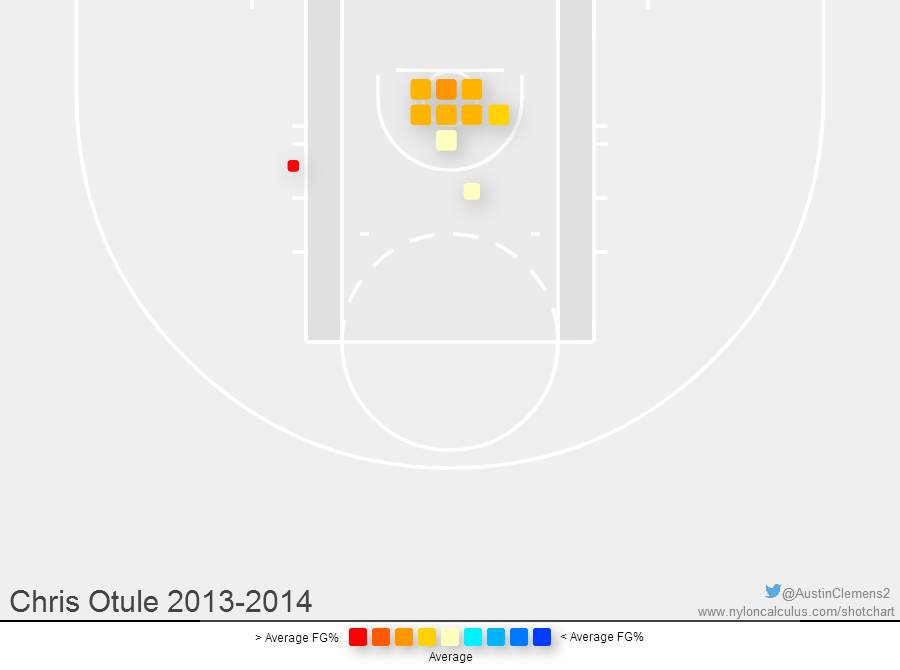
Image and data from Nylon Calculus
That one little red cube out of the paint came from one shot, preventing this from being a work of art from the big man.
Steve Taylor

Image and data from Nylon Calculus
Steve ‘s surgery hampered his development and that stunted growth was only exacerbated by the rocky relationship with Buzz. The result is seen above. Marquette will need to see a lot more from him this year to have any shot at being successful.
Jake Thomas

Image and data from Nylon Calculus
Jake was a one trick pony being used as a war horse last season. If you’d shown this chart to anyone before the start of the season, they would have been thrilled at how much red there was behind the arc. However, having had the season play out the way it did, people were berating Thomas on Twitter more often than not. Again, he was a specialist being asked to punch above his weight. The roster composition really tinted what would have otherwise been seen as a fairly bright season.


Leave a comment