Editors note: This is an expanded version of a story that appeared in the Marquette Tribune on Sep. 13. Special thanks to the Marquette Jersey Prjoect on the MU Scoop Wiki for insight and pictures.
On Tuesday Sep 6, Marquette Athletics tweeted a peek at the new uniforms for the men’s basketball team. Reaction around the interwebs has been highly polarized.
You’re either drooling all over yourself, counting down the days until you can drop a “Benjamin” at the Spirit Shop for it or feel like gouging out your eyes and using them for toilet paper.
The main debate has originated from the use of a back graphic like the elite Nike schools have worn the previous years.
Marquette’s uniform features Marquette Hall at the top, with a famous bust of Al McGuire below it. Under that is a circle that supposedly represents a basketball with the “MU” logo on it, followed by the year the university was founded (1881) and finally the Jesuit motto, “Cura personalis.”
At first I thought the design was well thought out but poorly executed. The features on their own were fine but stacked on top of each other they looked way too vertical.
But having been lucky enough to see them in person, I have been converted. Start saving up. These puppies are classic. The vertical vertigo is still present, but looks a lot more balanced when seen on a player than when shown on its own.
Are they one of the best the school has ever had? Not quite yet. Marquette has a storied history of great uniforms and only time will tell.
Which are better you ask? I have a top-5 list all ready for your enjoyment (with a few bonus uniforms for the online crowd).
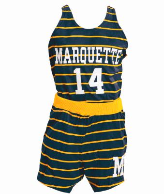
 Bonus 1973-76 Home: Goodness gracious, this jersey is something else. Zig-zag blue and gold lines on the side panels are fantastic and really stand out from any other Marquette jersey. And as if the zig-zags weren’t zany enough, you’ve got the gothic font for the nameplate FTW! I can’t find any faults with this jersey. It’s exciting, different and very appealing. So why is it not in the top-5 you ask? No one else seems to like them with the fervor I do. In fact, although most #mubb fans can identify almost all the uniforms with their respective eras, this one seems to always be forgotten. It does not have the mass appeal to make it an all-time classic. Why this is I have no clue, I’m just here to tell it how it is.
 Bonus 1981-’83 Home: Otherwise known as the urban camo jerseys, this sweet uni should be nicknamed the ‘Doc’ after Glenn ‘Doc’ Rivers who made this particular jersey famous. The side panels are simply phenomenal with the blue and gold camouflage pattern going up the rib cage. The only thing that kept this one off the original list and out of the top-5 was the font for the Marquette nameplate running across the chest. Complementing the side camo, it’s like accenting a Maserati with a Kia Rio. Way, way too simple for my taste. It looks like a middle school gym team. Had it used anything just a bit more exciting this would have definitely been one of the best.
 5) 1976-’79 Home: Imagine if senior guard Darius Johnson-Odom went home and drew up a sweet design for some new threads. Now imagine he took that design to coach Buzz Williams, who liked its so much that he had DJO sit down with Nike and hammer out the details to have Nike actually make it.
This happened in 1976 with Bo Ellis and Al McGuire. On top of that, these were the first jerseys ever worn untucked and were worn during Marquette’s one and only championship season. How could this jersey be left out? (As an added bonus point, Jamil Wilson said this was his favorite Marquette jersey from the old days.)
 4) 1969-’72 Roadie: The good old bumblebees. Marquette wore these babies en route to winning the 1970 NIT championship, back when it meant something. The psychedelic apparel was too good to be true, though. It was banned by the NCAA in 1972 when other teams complained it was disorienting when Marquette players jumped up and down. This uniform sums up what Marquette basketball is all about: originality and a brash style that dares people to look away.
 3) 2007-’11 Alternate: This is the jersey we all know and love. It was difficult picking between the golds and the baby blues, but in the end the baby blues remain more iconic. When Marquette comes out wearing these, you know it’s a big game. It doesn’t get higher in the standings because it hasn’t held up the test of time yet, but having the design remain similar for the newest style is a definite plus. (One minor quibble, I would have liked to see Marquette use the font seen on the jersey to the left instead of going with the one they did.)
 2) 1968-’73 Home: Very simple, very clean, but ultimately this 1968 jersey has all the makings of a beautiful jersey. The blue racing stripe on the side is accented with two thin, gold, parallel lines giving a common addition an exciting little twist. The circle around the number is the kicker, though. Although I don’t much like the Packers it maintains continuity with Wisconsin history. This design is unlike any other Marquette has had and would make for a great throwback for Marquette to wear in the near future.
 1) 1971-’74 Roadie: It doesn’t get any better than this. A perfect color choice with a distinct pattern and great font. It is because of this beauty that announcers say we have the best looking jerseys in college basketball — seeing as the current design uses this jersey as its inspiration. Think about that for a second. When the ladies and gents at Converse (and now Nike) got together to design the best possible jersey, they used this one as inspiration. That right there is the definition what it takes to be No. 1.


Trackbacks/Pingbacks
[…] 70’s. At first, I thought it was a direct replica, but after doing some research, they flipped the stripe to the other side yet it’s truly very close in distinction. Huge shoutout to Conrad Burry for putting these all […]
[…] created real excitement. Marquette had crazy uniforms and warmups, some pictured above. They changed them frequently. They played at Milwaukie County […]