We spend 3 to 4 months leading up to the season obsessively clicking on every way-too-early ranking, parsing each useless projected March Madness bracket and otherwise binging on any morsel or blurb mentioning our favorite team. But by December, all of those hours spent angrily yelling on Twitter about perceived slights are pretty much forgotten about. And by March there will be 0 recollection of those efforts, only to be repeated once more the minute a new champion is crowned.
With that in mind, I’ve made a habit of logging projections I run into over the summer and fall the past few years, and being a Marquette blog, focusing mostly on the Big East, in order to do a better job of putting on-court results in perspective with media expectations/predictions. This isn’t meant to be a gotcha to any specific outlet, but rather help publicize what the consensus was before the season started.
Below you’ll find two tables, one with Big East order of finish projections from 1 to 11, and then DI projected ranks (most all the way to 360+, but a few only the top-100). You’ll be able to click on the link to be able to read (or hear) it yourself as well. I’ll keep updating the results through tipoff.
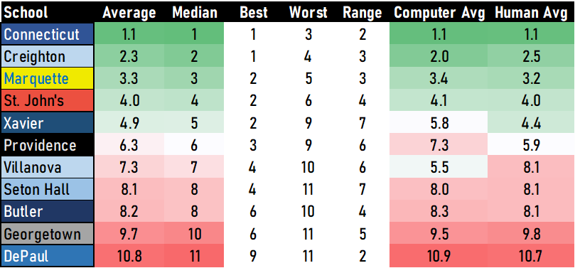
Big East Projections
Here are the Big East results for projected order of finish. Feel free to click on any of the linked oulets and you should be able to see the source/article/Tweet for yourself.
And here’s a tidy recap of each team’s projections. Xavier and Seton Hall have the widest range of possibilities, with a range of 7 spots from best to worst.
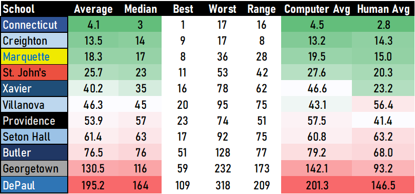
Full NCAA Projections
For the DI rankings, we don’t have quite as robust a sample (though I will continue to update this post publication), but we get much more variations on the result.
And this is how the recap looks, with a focus on how the computer and human models differ when it comes to the middle 3 teams (X, Nova, PC). Xavier is a human darling, while Villanova is in higher esteem with the computer models.
One final chart, I love to visualize not just where teams are projected, but what that range of projections looks like in a graph. The logo is on the average while the other end points are the highest and lowest projections.

Feel free to send any questions of complaints my way in the comments or to @PaintTouches on Twitter.
Make a one-time donation
Choose an amount
Or enter a custom amount
Your contribution is appreciated.
Donate

Leave a comment